Physical Address
304 North Cardinal St.
Dorchester Center, MA 02124
Physical Address
304 North Cardinal St.
Dorchester Center, MA 02124
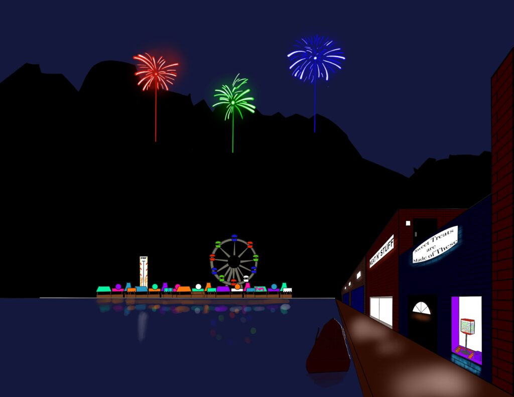
This is my first piece of serious artwork I’m submitting for my portfolio! I recently got interested in developing my art skills, so I started by designing a background piece focusing on using one-point perspective to construct the scene. I’ve made stuff using the Procreate App on my iPad, including memes, and section pictures for my math notes, and so was already familiar with the app in making my first piece of art.
I’ve seen many examples of beautifully illustrated background scenes, so I wanted to make one of my own. I have fond memories of going to the county fair as a kid, so I wanted to depict lots of booths and attractions. I also love the construction of Venice, Italy along with most coastal cities and port towns, so I wanted to depict building along a a waterway where people could shop and hangout.
It was Fourth of July weekend as I was working on this scene, so I also wanted to depict fireworks. As such, I wanted to render this scene at night time where the fireworks would be on prominent display.
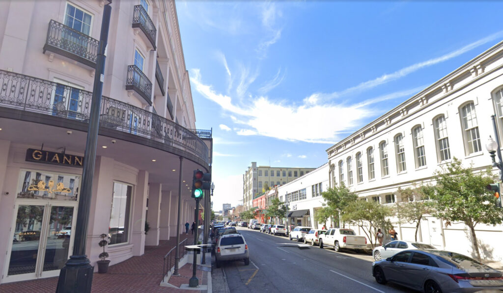
The first thing I did was use Google Earth to get a scene of a town displaying a strong one-point perspective scene. I decided to move around New Orleans in Louisiana to get a decent street view. Once I picked a location I liked, I simply took a screen shot. I also wanted to gather references of coastal towns in California to see how shops would look along a coastline. I was looking at photos of Venice, Italy and noticed that a lot of the walkways were simply concrete and pavement of some sort, so I abandoned drawing a wooden walkway, and decided to draw concrete walkways instead.
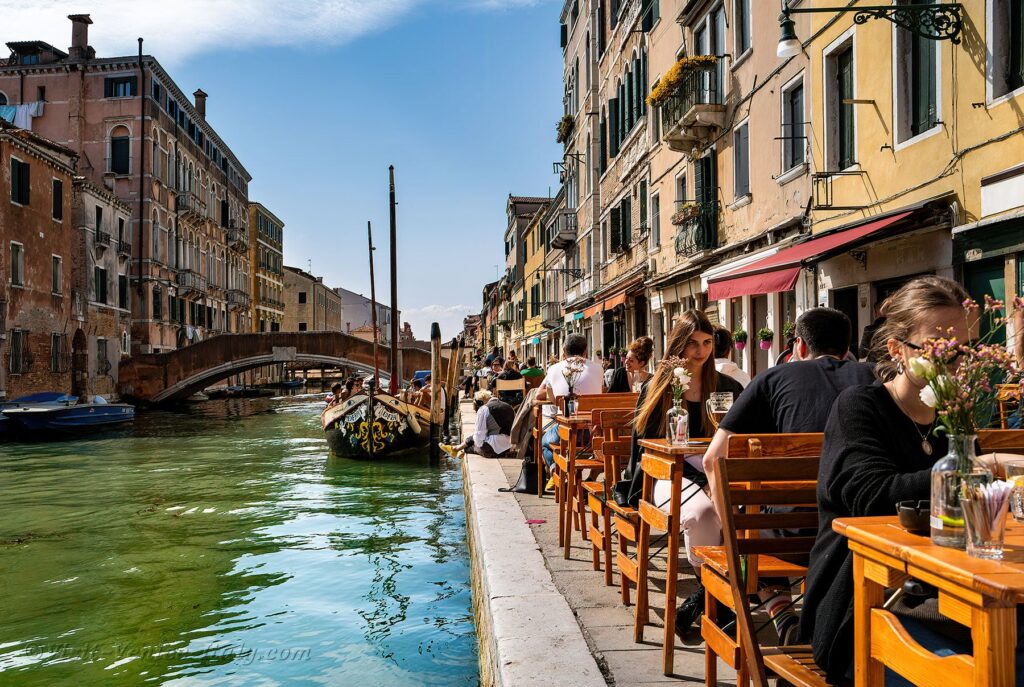
I also wanted to get a good reference showing a landscape in the distance beyond a body of water, and a reference showing mountains in the background.
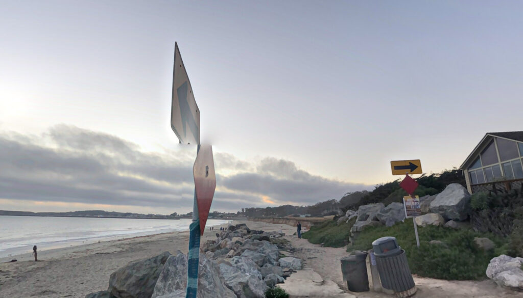
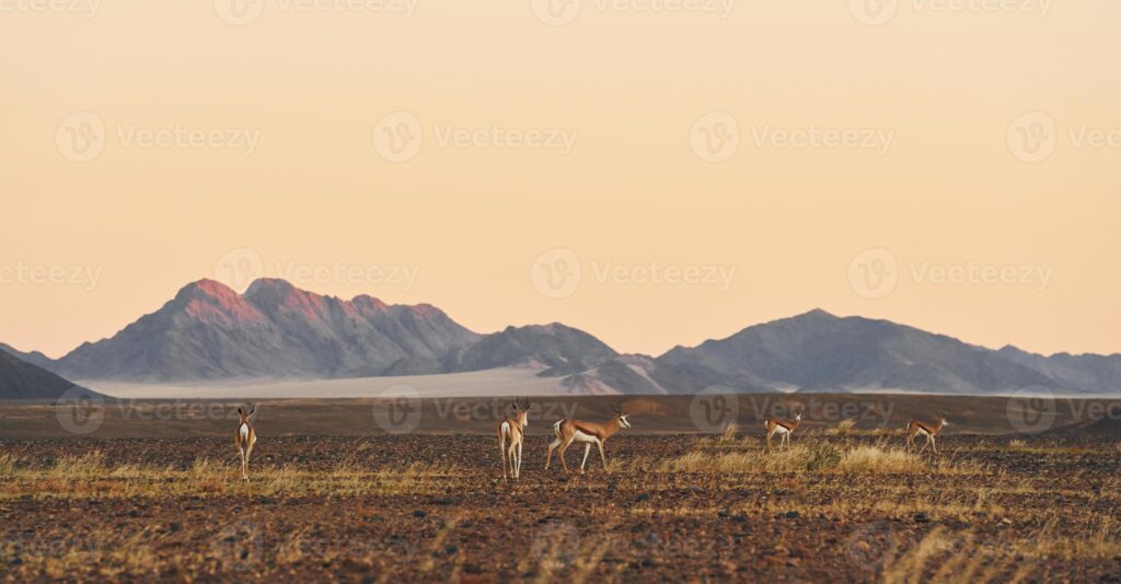
At this point, I had a good idea of where the main structures and features of my painting would be placed in my painting.
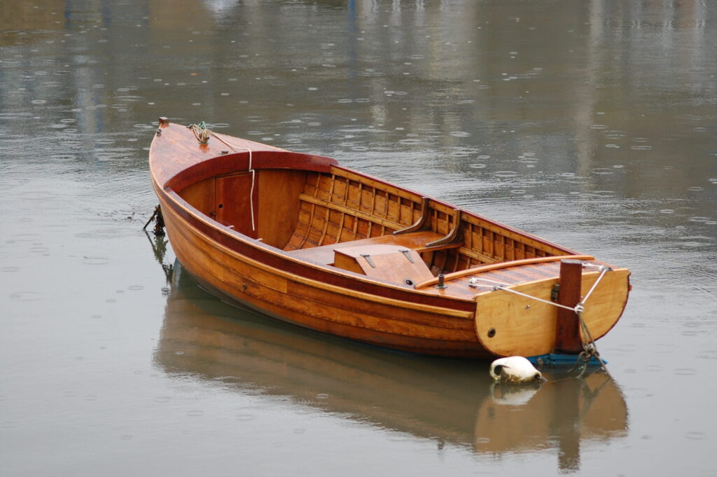
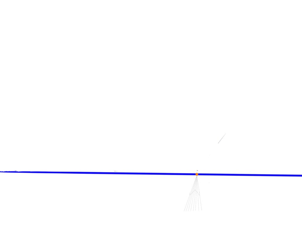
I wanted to show a boat docked near the stores in the foreground, so drew perspective lines for a boat based on the above reference image. I drew multiple lines so I could draw a floor that looked like it was made up of separate base boards.
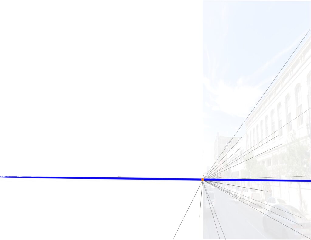
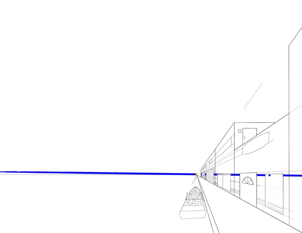
I start with the street view of New Orleans, and draw lines extending from all the rooftops to see where they intersect. This point becomes the vanishing point (colored orange) for the perspective. From there, I draw a horizontal line (drawn in blue) to represent the horizon line. I decided to cut off half the picture, and just focus on the right half. I decreased the opacity of the picture, and drew the perspective lines on a new layer.
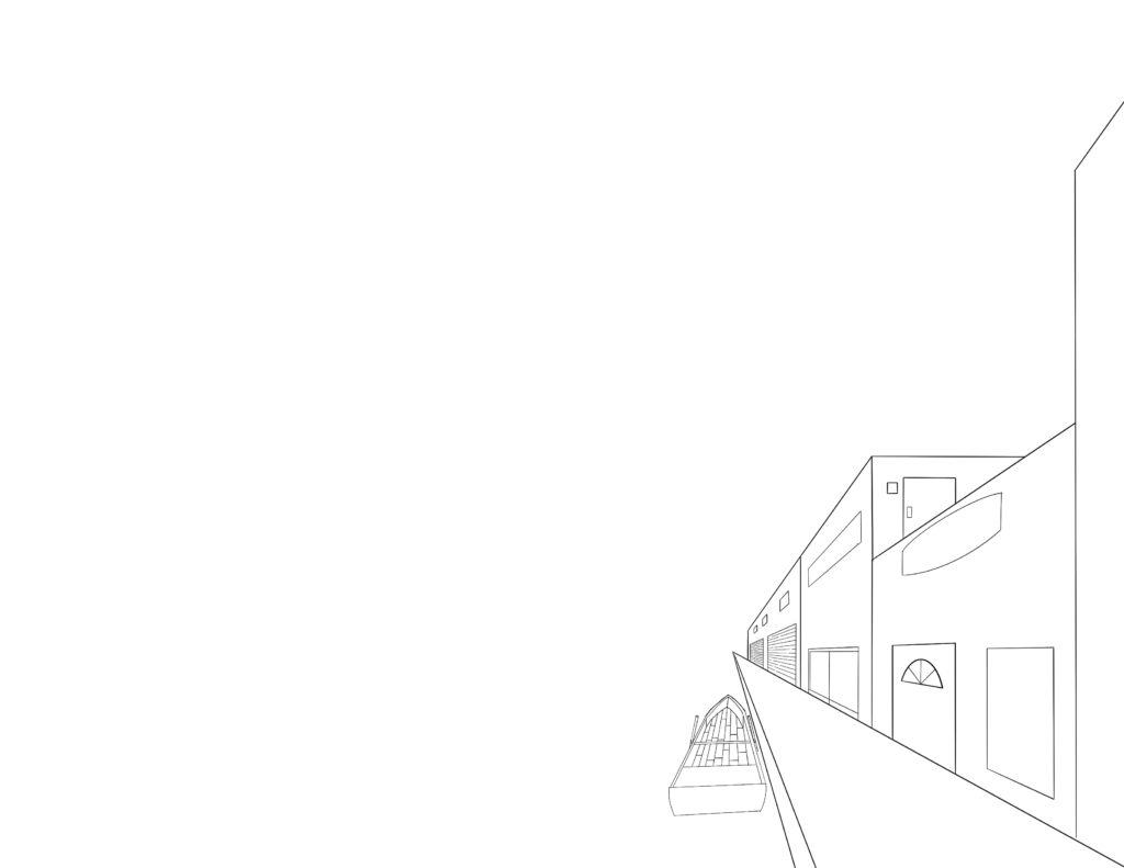
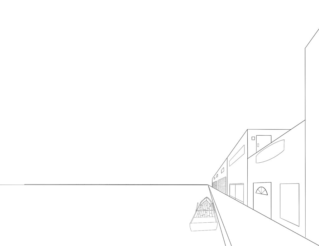
Once I had the main perspective grid constructed, I was able to provide a basic outline of my scene. I wanted to have buildings with different heights. I also drew in perspective squares for windows and doors. Once I was happy with the buildings, boat, and sidewalk, I turned off the perspective grid layer.
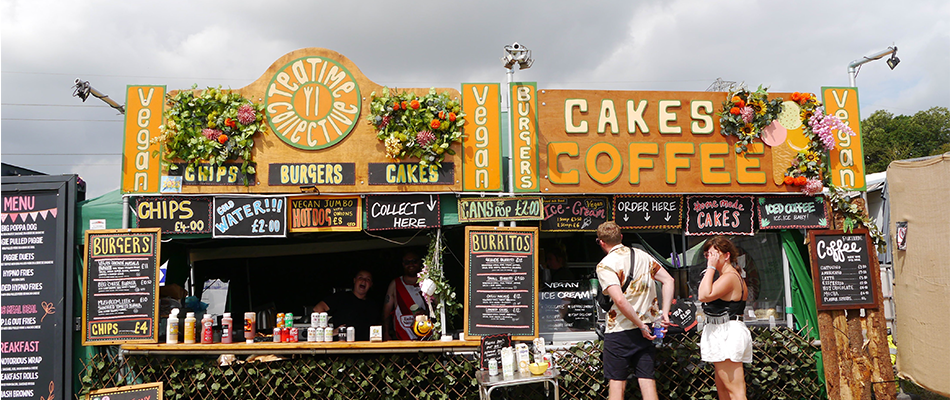
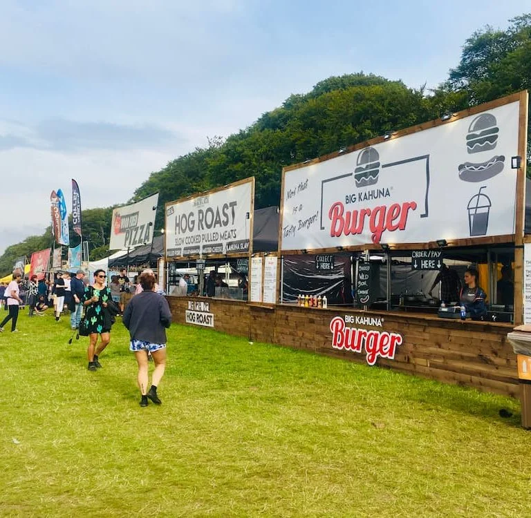
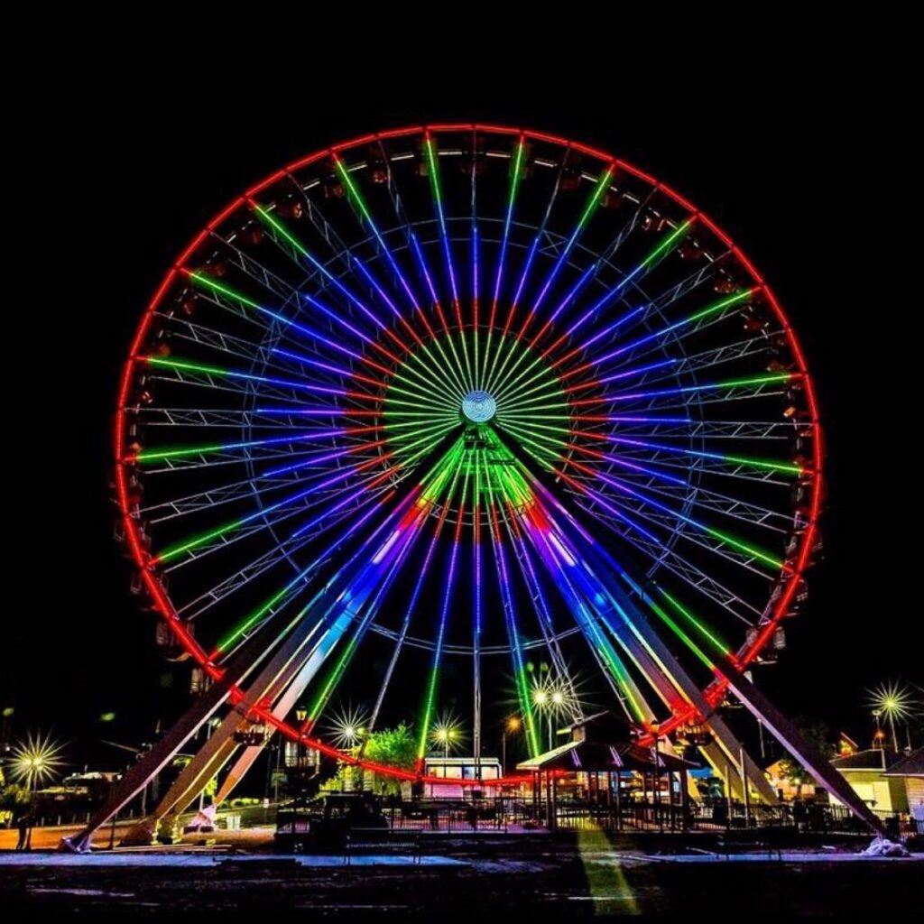
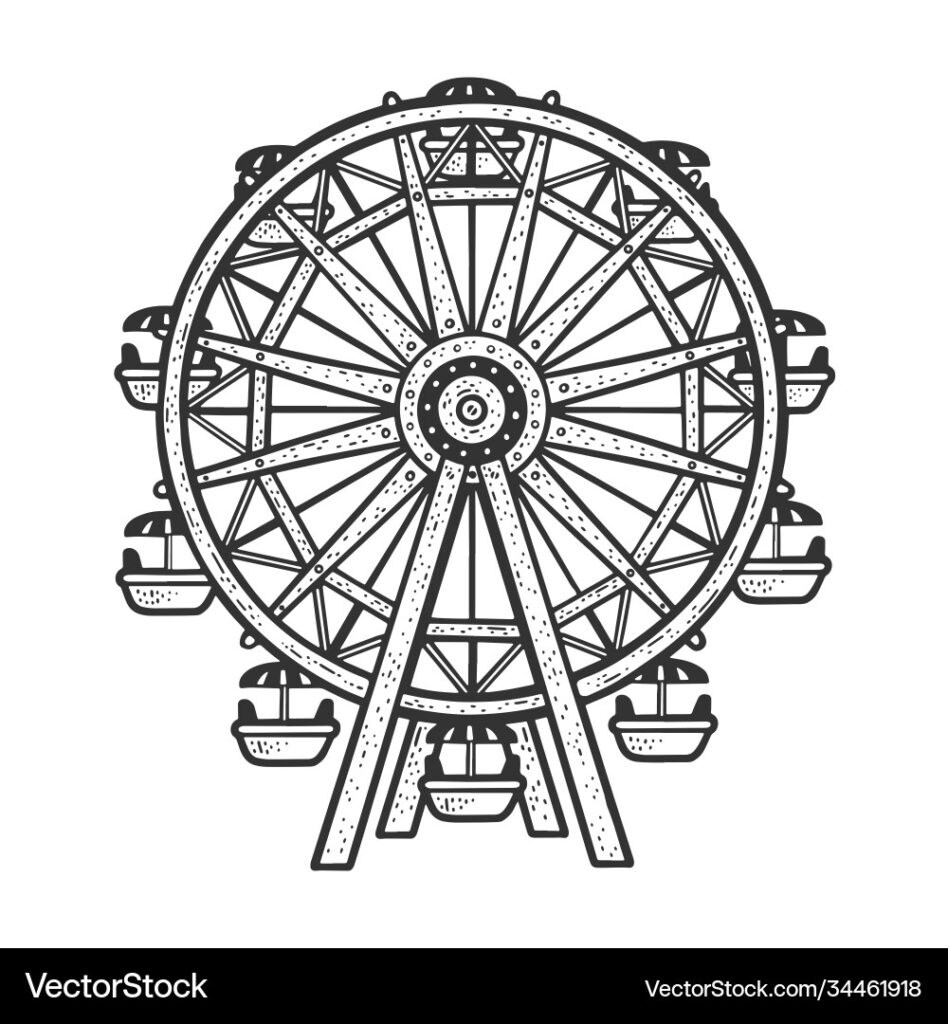
To design a fair-like setting, I looked for photo references of rides and booths. The above four images provided the main designs for my artwork.
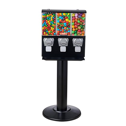
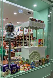
I took some time at this stage to add in some details to the candy shop. I used these references to get a basic idea of what to draw.
I wanted to create a fair scene extending along a pier. The first thing I did to achieve this was to draw two horizontal lines just above and below the horizon line. Since this part of the scene was depicted in the distance, I didn’t apply perspective to the construction of those elements.
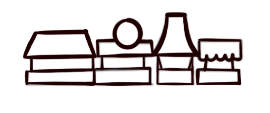
On a new layer, I drew four different designs of booths and stalls.
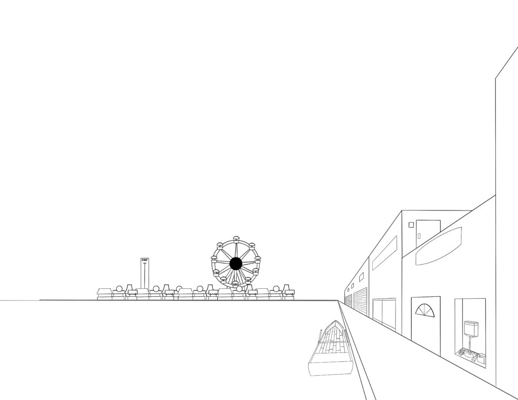
I then put each into multiple separate layers and played around with the arrangement to create a scene. Using the reference for a Ferris wheel, I also drew a Ferris wheel of my own. Once I was happy with the arrangement, I collapsed all layers into a single layer. Similarly, I also drew a hammer and strength game on a separate layer. I arranged the layers to provide a sense of depth by making some booths appear in front of others. I also had the Ferris wheel and strength game appear behind the booths as well. Once I was happy with the arrangement, I merged all booth layers, Ferris wheel layer, and strength game layers into a single layer.
I wanted mountains in the background, so I took one of the environment reference photos with a mountain, and traced the mountain in the background.
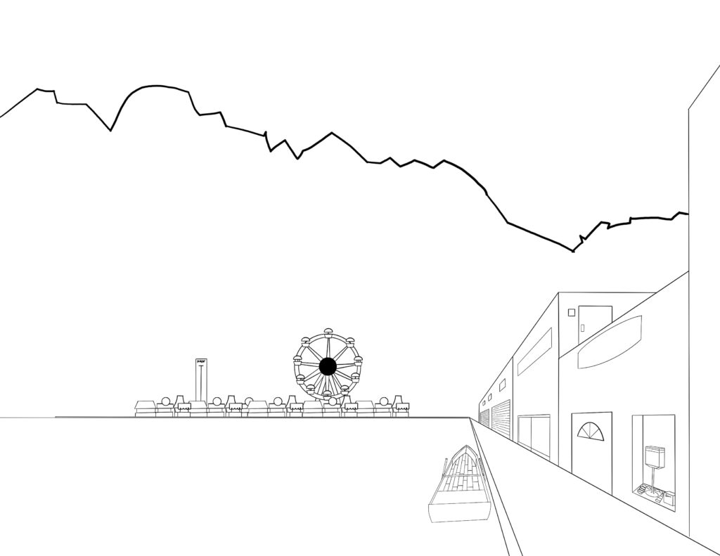
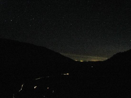
Based on this reference image, I decided to paint the mountains black, and painted the sky a dark blue color.
I wanted this scene to take place at night, so I gathered reference images at night time that included mountains in the background. Based off the reference, I knew I wanted to paint the mountains totally black, while the sky and water would have a very deep blue color.
Furthermore, I knew that I wanted to paint most of the buildings a standard brick and mortar color. This would allow me to add emphasis to the booths, Ferris wheel, and candy store building by coloring them with brighter colors. Since the candy store was in the foreground, and away from the lighting provided at the fair, I decided to desaturate the colors used in the buildings, boat, and sidewalk.
It was here that I also decided to render some light coming from within the buildings. To do this, I took the base color from the buildings (fully saturated) and lightly airbrushed around the doors and signs at the top of the buildings. I colored the doors and windows fully white to indicate where the light was emanating from. Basically, I wanted to paint everything that emanated light with fully saturated colors, and desaturated the colors on non-light producing elements.
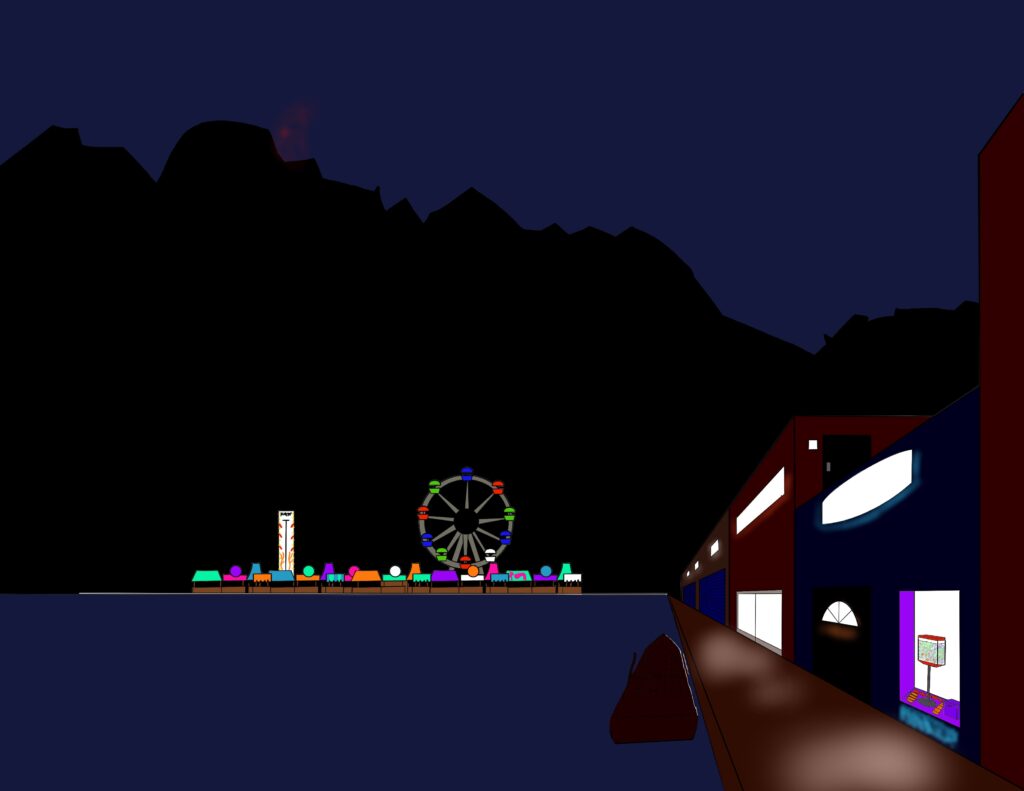
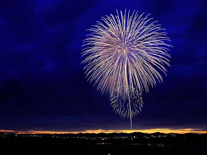
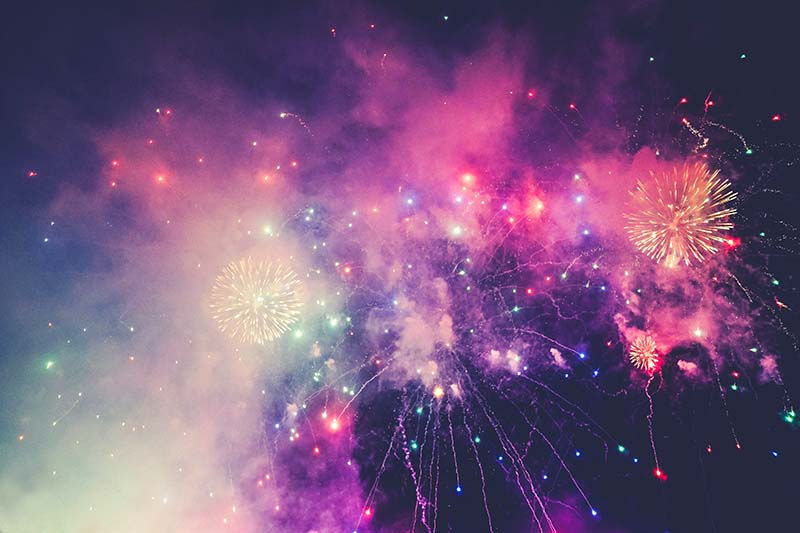
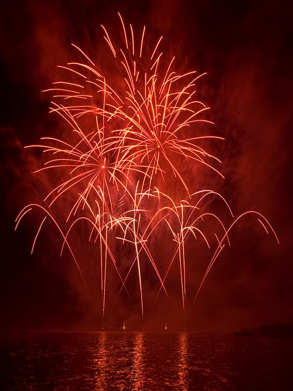
I noticed a few things when looking at these reference photos for fireworks. Fireworks produced a lot of surrounding smoke, and the center of each of the streaks appears to be bright light, which was either pure white, or had a tint similar to the base firework colors.
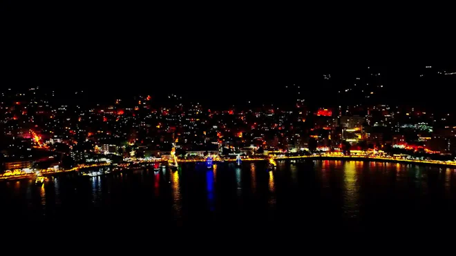
Here, I observe how lights tend to be reflected in water. Because water seems to distort the lights, I decided to draw reflections as abstract copies of what was being reflected.
In the home stretch of this piece, I decided to add in a few more details. As this was around July 4th weekend, I was inspired to add in some simple fireworks to my scene. I gathered some reference photos to get an idea of how to execute the idea. I first drew the base fireworks using a solid brush. Then, I took a smaller solid brush, and painted the centers of many of the streaks pure white. Finally, I took a large soft airbrush using the base colors, and softly tapped around the centers of each of the fireworks.
Next, I decided to work on the reflected. To make my reflections, I took a hard airbrush using the base colors of what was being reflected, and mirrored their positions in the water.
I also decided to write some text in the building signs. I distorted the text using Procreate’s “Distort” feature to wrap around the curvature of the signs as necessary.
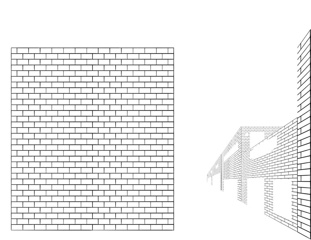
Finally, I created a brick texture, and applied that texture to the buildings by distorting copies of the brick texture to match the perspective grid.
After including all of these final touches (all on their own separate layers) I was left with this piece:

Something I thought about after finishing this piece was the level of detail in the candy shop. In the future, I think I’d like to draw in more candy types. For example, it would be fun to draw candy beads strung along wire that’s strewn about and draped over in the window. Cotton candy and lollipops would also be fun to render.
To add an additional point of interest in the piece, I could have drawn in a character. To make this piece more dynamic, I would add in a character next to the candy shop, perhaps someone who just got off the boat. I’m still learning how to draw people and characters, so that’s something I get to look forward to.
I’ve been watching a lot of tutorial videos about coloring in backgrounds, and in doing so have learned about values. There were a few times I would flip the scene horizontally to see if it still looked good, but I never did examine gray values of the scene. To be fair, I wasn’t creating this piece to tell a story or to emphasize one particular element. In the future, I can look at values to see where the visual contrast is occurring. If anything needs to be corrected, it can be fixed. I could also do an initial painting in gray values. This should allow me to emphasize specific elements with intention.
Upon further inspection, I think I added too much white color in the blue fireworks. The read and green fireworks look good in my opinion, but the white streaks in the blue fireworks are overpowering.
In the future, I can incorporate characters, and compose specific scenes in order to tell a story.
I watched some YouTube videos about perspective, drawing backgrounds, and painting backgrounds.
Here are two videos by BaM Animation on backgrounds..
I also watched a video by Ethan Becker, where he describes how to analyze the perspective being used in a background piece, as well as how to use shape language and line style.
There was one book I used to study perspective. It covers the standard cases of one-point, two-point, and three-point perspective. It also covers dealing with multiple vanishing points, and curvilinear perspective.